The target audience of this magazine would be both boys and girls. This is because, the colours used, blue, green, and grey are more associated towards boys, so it could be that the choice of colours were to make it appeal to boys as well as girls. This will also appeal to girls because, the images are of Zayn Malik and Harry Styles who girls will be attracted to, and girls are more known to like the band
they are from One Direction, so because of the choice of celebrities it will appeal to girls more.
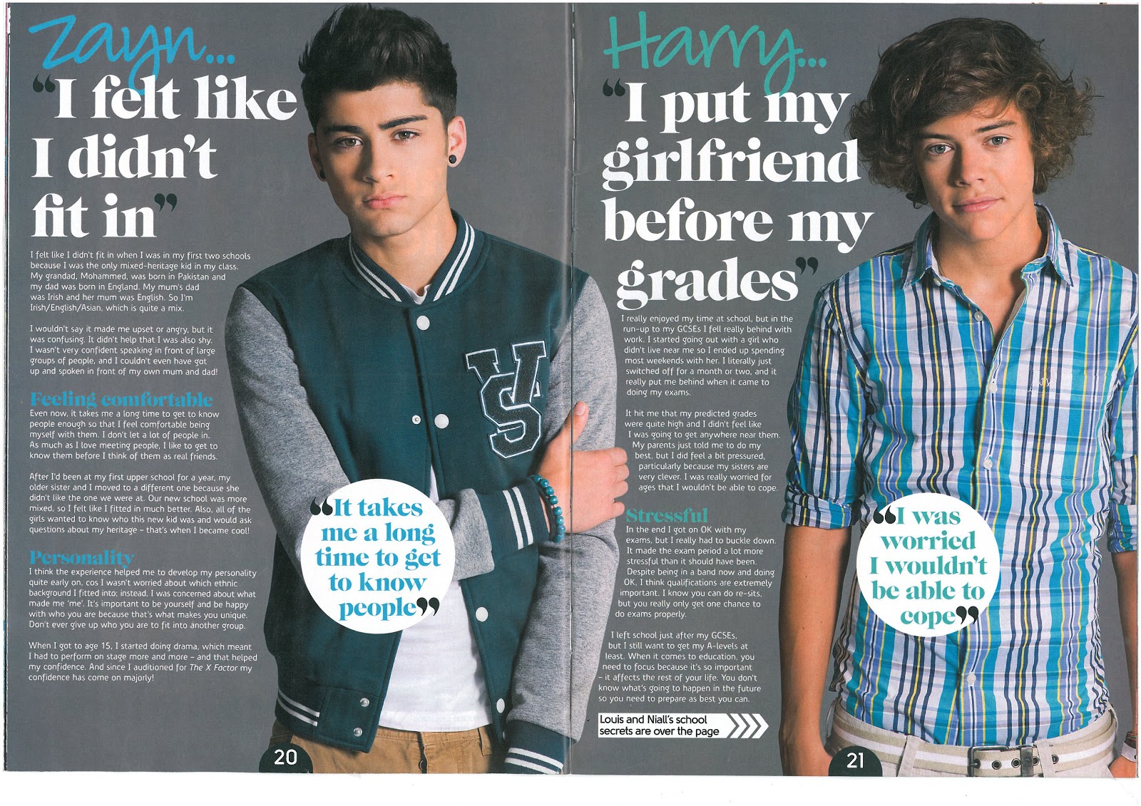
The layout is simple as, one one side of the page there are images and on the other side of the page there is text and the title. The double page spread is symmetrical on both sides, which makes it easier to read, but also separates the two people the page is about, giving each celebrity a page of their own. Also the shot type of the main images are medium long shots so it conveys how, it is also aimed to males, as if it was t be just females be more appropriate to have a close up of the faces.
No comments:
Post a Comment