
The photograph itself is better on my music magazine. This is because it was taken by a SLR camera whereas the college magazine photo was taken by a digital camera, so the photograph on my music magazine looks more clear and of better quality, making it look more professional. Furthermore, the way in which I have edited my music magazine photograph looks more professional as I was able to cut around it on Photoshop to make the whole image look even along the sides, on the other hand the photo on y college magazine hasn't been edited as good, as especially towards her hair it looks uneven. I have also paid more attention on the clothing of my model on the music magazine cover by making it suit the genre of pop, choosing an item of clothing which is of the colour pink and blue, which is associated with pop music magazines. I have also used more images on my front cover this was to make it suit the pop genre.
on my music magazine I have also considered the choices of fonts and the sizes more. On my college magazine I just used two different fonts and I didn't take into consideration the sizes, especially of the cover lines, as it doesn't looks at neat as the cover lines on my music magazine. Whereas on the music magazine I have used three different fonts between the masthead, cover lines and I have also used a separate font for things which I wanted to stand out such as celebrity names. I think this had overall made it look a lot better and more professional, as the text looks as though it is neatly together and not all over the place like my college magazine.
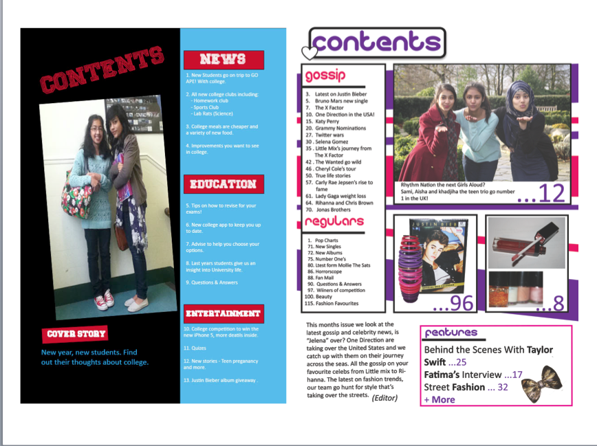
The layout of my contents page looks a lot more organised and neater on my music magazine, compared to my college magazine. I have made it similar by having different sections such as "gossip" and "news" though I think I have made the sections more effectively on my music magazine, through the use of boxes. I have also used the red colour scheme more effectively by conveying the colours through the stripe background on my music magazine contents page, I think this suits the genre of pop more, and is something which my target audience will find appealing. On my college magazine however, I have used e colours through the plane background colours.
The text also looks a lot more better on my music magazine, as I have used the same fonts as my front cover and positioned them more carefully, as looking at my college magazine they all haven't been positioned in the best way, where it says "cover story" the text doesn't seem to be in line with the box that it is in. I have also on my music magazine made it so that the page numbers are all different, whereas on my college magazine the number go in order unlike professional magazines.
I have used a variety of images on my music magazine contents page, they are again of better quality than my college magazine, as they were taken by a SLR camera, so they look more clear. I also took different images as pop music magazines tend to contain a lot of images and of different things such as, make up etc... So I decided to do this on my magazine as well to make it look more professional. Overall this made it look better than my college magazine as that had only contained one image and wasn't taken or positioned as effectively.
No comments:
Post a Comment