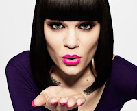
Posture/Gesture - Both images have the same posture of leaning forward towards the camera, this makes them look friendly and as though inviting the reader to read the magazine. They also have their hands out and pointing towards the camera, which again looks welcoming, and their overall body langauge comes across being fun and quirky.
Expression - Both images have similar facial expressions. Though Jessie J (right) has a more seriouse facial expression, whereas the models which I have used look more happy, and are smiling more, which relates to the magazine making it have a fun vibe towards it, which suits the genre of pop. Both images are also making directing eye contact with the camera which makes them seem pleasant.
Angle - Both images have been taken at an angle which is eye level to the reader, which makes it seem as though they are looking straight at the reader. This makes the artists come across as being open, friendly and instantly makes the artist look more likable.
Shot Type - The images are two different shot types. The image on the right is a close up shot, making it focus more on the artist, and so hoping to sell the magazine for the choice of artist. It also allows the reader to recongise who the artist is and see their make up, facial expression etc... However, I have made my image to be a medium shot. This is so then it allows the reader to see the setting, and being surrounded by greenery gives a charasmatic effect to it being rather bright and colourful. It also allows the reader to see what the artist is wearing which automatically shows the genre of the magazine, and also suits the pop genre, as pop magazines tend to include things on fashion.
Lighing - The lighting on both images is bright. This will suit pop magazines as, it being bright gives connotations of happiness, and fun which will make it appeal to the reader, rather than being dull. On the image on the right, it allows the artist to stand out more from the plain background,whereas on my magazine the bright lighting and the vibrance of the colours, make the whole image brighten up more iotself.
Costume - On the image ont he right it doesn't let the reader clearly see what she is wearing being a close up shot, which conveys how it is more focused on the artists rather than the clothing. On my image the big difference being there are three models, I taken it so that the clothing is more visible, and they are each dressed differently. The first model is wearing a red coat, which gives connotations of love etc... This will suiot the gnere of the magazine as many pop magazines focus on things like this with celebrities. Futhurmore, the model in the middle is wearing a bright blue top, this again reflects the genre of the magazine being bright and colourful. The last model however like the artist on the right is wearing clothing which doesn't stand out as much. This was so then they each have their own individual look.
Hair/Make-up - On my image the two models on the right have the hair simply tied up, this is so that it look more relaxed and effortless, all three models also have subtle make-up on, this was again mainly for the focus to be on themselves but the clothing mainly, and the setting, and not too much on thie faces. On the other hand, the image on the right has clearly taken time to focus on her hair and make-up, as her hair looks nicely done, and also her make-up is simple like my models but, she has bright pink lipstick, which would suit the pop genre. So they have clearly made it so that the reader focususes on her and her features.


No comments:
Post a Comment