This is what I have done on my contents page so far.I have just started to make some of the columns with stories which are inside, and also designed it to make it suit to the magazine colours, using the same colours and fonts, but just created a pattern, as looking at other pop contents pages they are bright and colourful, though sometimes colourful but simple.
Friday, 30 November 2012
Wednesday, 28 November 2012
Magazine - My Front Cover So Far (2)
I have changed my front cover by changing the masthead. I have changed the name of the magazine from "LOUD" to 'Pop Chic", I have also changed the font and I think this looks better as it it is appropriate for the genre of Pop and will also appeal to my target audience of girls aged 14-19. I have also changed the colours by having the colour pink instead of red. I think the overall masthead is better as the colours and font will make it appeal to my target audience as it isn't too feminine or masculine, as the colour pink is feminine however the colour purple isn't so it will make it appeal to a variety of girls based on their personalities.
Research and Planning - Magazine Poses
Magazine - My Front Cover So Far
So far I have made my masthead however it is not complete and I am thinking about changing it, I have also added a bar on the bottom mentioning some "exclusive" things inside the magazine.
Research and Planning - Photographs
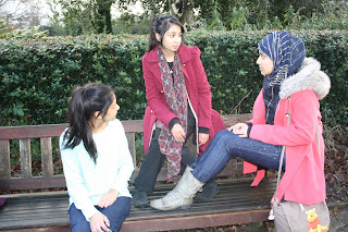
These are all the images which I had taken and from these I had selected some to put into my magazine. The images which are in large are the ones which I had chosen for my magazine. This is because I think they had suited the genre of my magazine, and also some of the images which I had chosen match with the stories I had included.
Subscribe to:
Posts (Atom)


